Artist Research – Hayao Miyazaki
- Where were they born? Where did they grow up? Where do they live now
- Born in Akebono-cho in Bunkyō, Tokyo
- Grew up in Suginami-ku, Tokyo
- Hayao now lives in Tokyo
- Where did they study art? Or are they self-taught?
Hayao taught himself how to draw and illustrate
- What kind of art do they make?
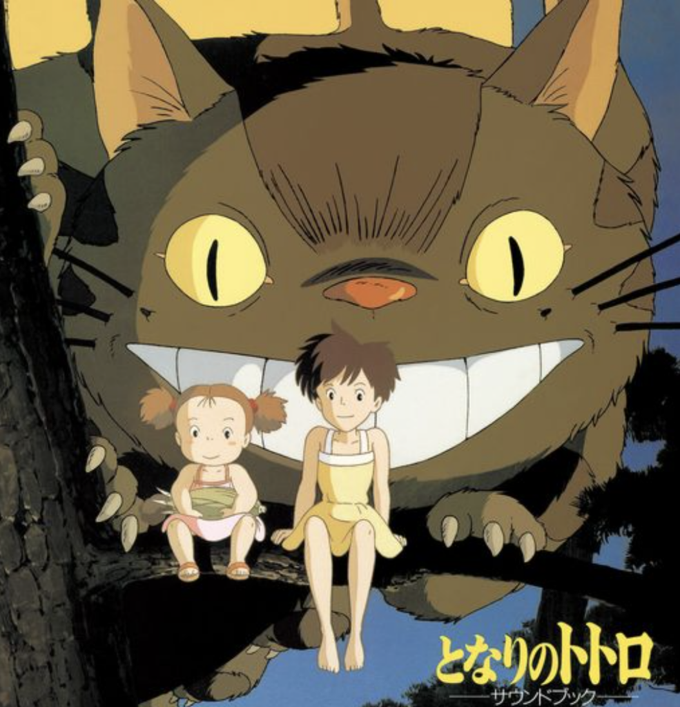
Hayao Miazaki makes very famous animated movies like “spirited away” and “my neighbour totoro”. He started off as an illustrator and taught himself how to draw.
- Looking at the selected artwork
- What are the formal aspects of her work (size, colour, materials, texture, value, composition, genre, style, etc)?
The main aspects of Miyazaki’s work are animated movies. They are all in the genre of anime, and all movies have a very japanese style artwork to them.
- How do these formal aspects affect how you “read” the artwork?
It’s important to know where Miazaki is from. Japanese art and culture is very distinctive and it helps to know it to understand the artwork more. I’ve seen plenty of his movies, but I learned a lot more after educating myself on the culture and why they use specific elements.
- What materials and methods might she be using to make these works?
Hayao has drawn all the concept art for his movies. He likes to produce visual storyboard and then construc the story around that, this allowed him to let his imagination run free.
- What is the context for this work (when this work was produced, what is going on politically, theoretically/philosophically, in the art world, in their personal life)?
His work explores themes such as environmentalism, social justice, feminism and various challenges that the individuals face in their world. He also likes to show lots of themes in love, family, culture and strongly in Japanese culture with war.
- What emotions does the work elicit for you?
I watched one of his movies when I was 12 and it really sparked my imagination with nature and the outdoors. I’ve always felt happiness and curious when watching his movies, they really make you feel like you are apart of the world because it’s really similar to what we all go through.
- What ideas does the work cultivate, or questions does the work ask you to consider?
The deeper messages that his movies have. They all have excellent animation and storytelling, but they also have in-depth meanings to what we experience in real life (Pollution, war, sexism, poverty).
- What does the artist say about their own work?
Hayao says that the most imagination comes from starting with a storyboard. If there is no script, there are no bounds to the visuals and imagination your work can have. He would always just let his imagination run wild and pump out ideas, moods and visuals.
- …… What other questions about this artist or their work do you have?
I’m wondering how long one of his more famous movies took to make. His movies has no SGI, they are all hand drawn visuals made into an animation. There is so much detail and thought put into each second of all of his movies that it must take years to make.
- Is there anything about this artist’s work that interests you? What and why? If not, can you articulate why that is? What is missing for you?
There are two things that I always loved about his work, Most of the protagonists are female. Hayao has always been a feminist and really liked to show that in his work, he likes to show the trials and tribulations that girls had to go through in Japanese culture.
The other thing he does well is blur the lines of good and evil. There are a couple movies where there are a couple obvious enemies, but when the movie nears the end they end up morphing into the story line of the main character and offers help and services as well.
- Is there anything about this artist’s work that you can carry over into your own art practice? What in particular?
I will carry over some of the smaller intricate designs into my poster. I will be making a retro futurism destination that people can go to, and I want to use inspiration from the movies to make the dashboard of the ship and details of space. The bright colors and animation is also something I’ve always loved so I will try and carry that over as well.
- Include the links to the websites you attained your research from.
- https://www.openculture.com/2022/05/hayao-miyazaki-the-mind-of-a-master.html
- https://en.wikipedia.org/wiki/Hayao_Miyazaki
- https://ghibli.fandom.com/wiki/Hayao_Miyazaki
Project Re-state
For this last final project, we are to come up with our own project. This will include the medium, idea, mood, and focus of the entire piece. We are to think about ideas and premises before we start to visualize and pick a medium to work with. Once we have a rough idea of what we want to include, we can think about the actual materialization of it and start to decide what we will create with it. We will have to do our regular project documentation updates as well as give an artist statement at the end.
Project Outline
Mood Board & Brainstorm
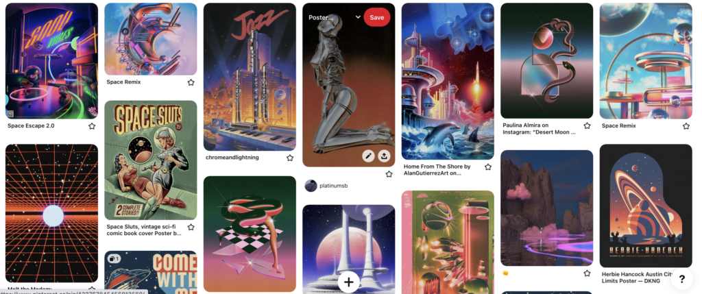
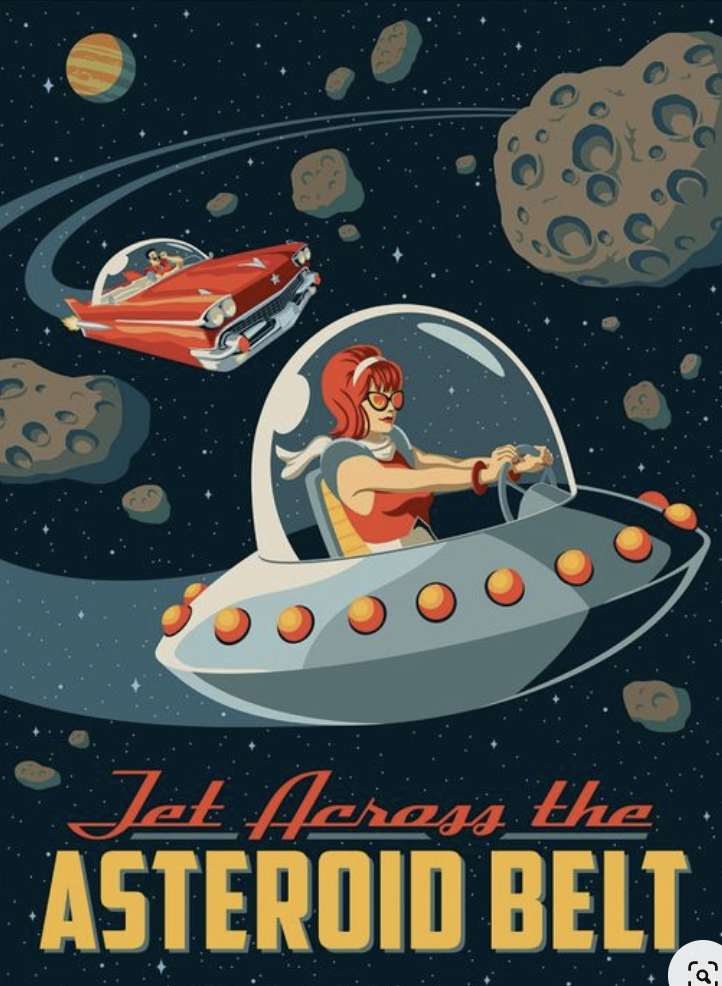
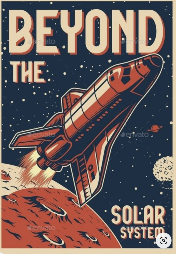
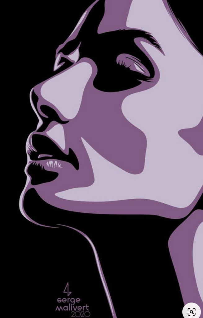
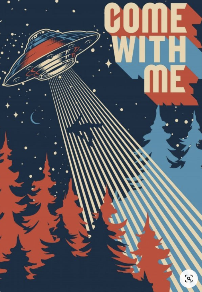
I made a pinterest board with all the art work that I am getting inspiration from . https://www.pinterest.ca/sambrunelle/poster-inspiration/
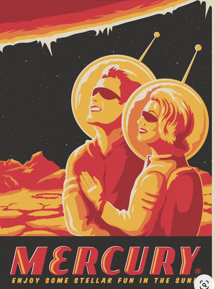
Above is a gallery of what I used as hard references. The first row is from Pexels and Pinterest. The last two are from an AI generator.
Project Documentation Update #1
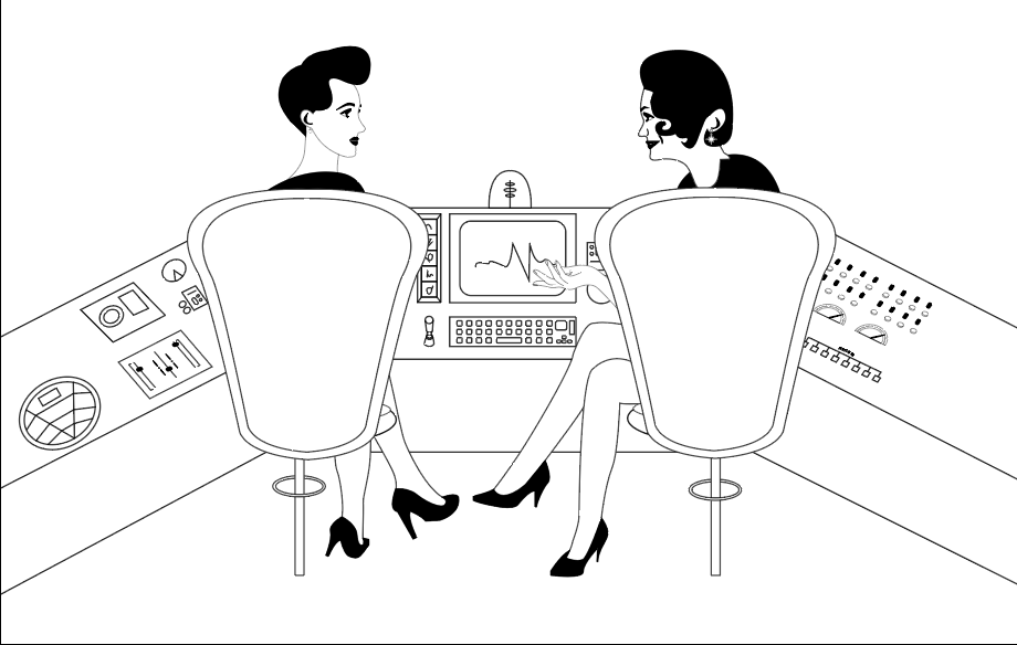
(very) rough sketch of the backbone for my poster.
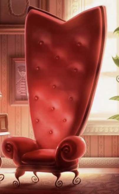
This is what i’m going to be aiming for. I want these two girls to be looking at each-other while they have a conversation. They will be sitting in two chairs with a control panel in front of them. Beyond the ship there will be a space scene with some stars and a planet with structures on them. I haven’t decided what the text will say, but it will be some sort of ad for a destination in space. The big bar above the girls is a part of the ship.
I realize that I might be shooting for the stars with what I want to achieve. My next step with this poster is vectorizing it and figuring out the effects as I go along.
Above you can find the type of artwork i wanted to try to do. I might have to change a couple of aspects to go with my current level of skills because i’m not well versed in depth of field, shading and lighting yet.
Here is an example of the direction i’m going to lean towards more.
I’m still going to include lots of retro effects and patterns, but i’m going to be giving my poster a more 2D look to it with minimal shading.
Project Documentation Update #2
I have fully vectorized my sketch. I am very happy with how it turned out, and I am excited to start adding some colour to it so I can see it come to life. I didn’t include the rest of it because I started working on it without saving a copy , I found this screenshot on my desktop so you could see what some of it looked like before full colour.
Here are some snippets of the colours and fonts I want to use
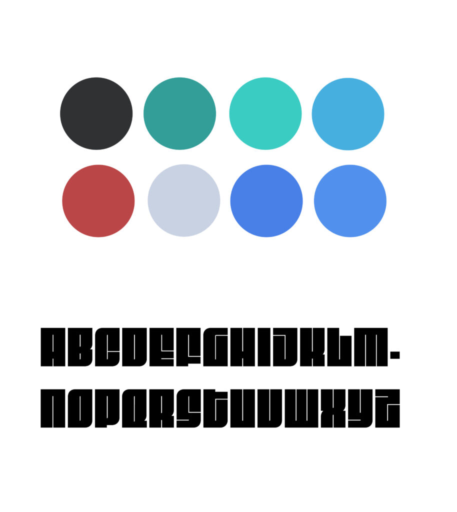
I decided to go with a (mostly) blue colour palette.
With the progression of this diploma that I started last year, i’ve been learning how to use and apply the basic fundamentals of design to create new things digitally and physically. I’m really happy that we got the chance to create whatever we want with this project. The next medium I wanted to work with was digital art, so this was a perfect way to put some of my skills to the test.
I did some research and looked at different font’s that were on 50’s novels, I took those and put them through the adobe font finder and found this font that was the closest match. The legibility isn’t the best so I will keep looking, but I am going to settle on this one for now.
Here is a transition I went through with my poster so far. The one with colour isn’t close to being finished, I am trying to play around with shading and perspective through colours. I am really learning a lot from this because i’ve never done something as elaborate as this before.
Project Documentation Update #3
Here is my poster with some major changes. I really wanted to make it pop and bring some life to it, so I did some research on shading and applied it to every aspect I could. I added shading to a lot of the ship, casting a shadow from all the pieces on the ship panel to show where the direction of the light is coming from. I added a bit of shadowing to the girls faces and legs to give a bit of depth to them without using lines to show their outlines.
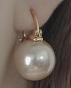
For the space part of the scene, I added lots of stars and a light glow around the planet to give it an atmosphere. This poster couldn’t of been set in the 50’s without some light flares. I added it to the typography, girls earrings, and to the bottom of the right chair.
I changed the font to a san serif and a script for more legibility compared to the previous one. I took out the bit of red that I had in the previous draft of my poster to show some cohesiveness throughout. My previous title was a little lacklustre in the hierarchy department, so I used the perspective tool to give the type a slant effect and gave the type “your new holiday destination” a cool neon sign.
I added a couple filters to my poster so it could have a more vintage feel to it. I found a free jpg image of a worn out piece of paper and I overlayed it so it would only show the patterns of it. It turned out a little dark so I put it through photoshop to add some brightness and life to it.
Here is the final poster, I am beyond happy with how it turned out. I liked how it look before I added some filters to it, but the filters really give it that aged look and helps tie it all together. I have learned a lot about illustrating by researching technical design practices and how to give something an overall feel of the retro futurism effect.
Brainstorm for Artist Statement
Letter
Dear Jacob,
I’ve been going through it with trying to understand shading and point of view for my final project. I don’t know why I put myself through projects that are above my skill level, I guess thats how we learn hey? I came close to scraping my poster and starting fresh but I wasn’t raised to be a quieter. I know practice makes perfect but i’ve never pushed myself to do something like this (even though I’ve always wanted to), so i’m glad that I am given the opportunity to do this. It’s making me believe that I will be able to do whatever I want with my life if i apply the same drive with this project, course, diplomat ect. I am happy that I got to do this Class
Sincerely, Sam
Artist Statement
Illustrating is something that I have grown to love while being a student, I really wanted to apply the skills I have learned and develop new ones with this project. For my digital art poster, I really wanted to capture the essence of retro futurism, how people in the 50’s would imagine what the future would look like.
I’ve always been fond of the 50’s – 90’s and I always try to include that in my work, this poster was no expectation. Most of my research in this project was to get a better understanding of the 50’s aesthetic and the elements that I could use going through the design process. I feel like I captured all of that quite well, I want my audience to look at my poster and think of an older decade reimagined in a fun and quirky way. I hope you feel a sense of nostalgia and adventure when looking at this piece, it’s something that I feel internally, and I wanted to try and manifest that.
Guest speaker – Jeremy Borso
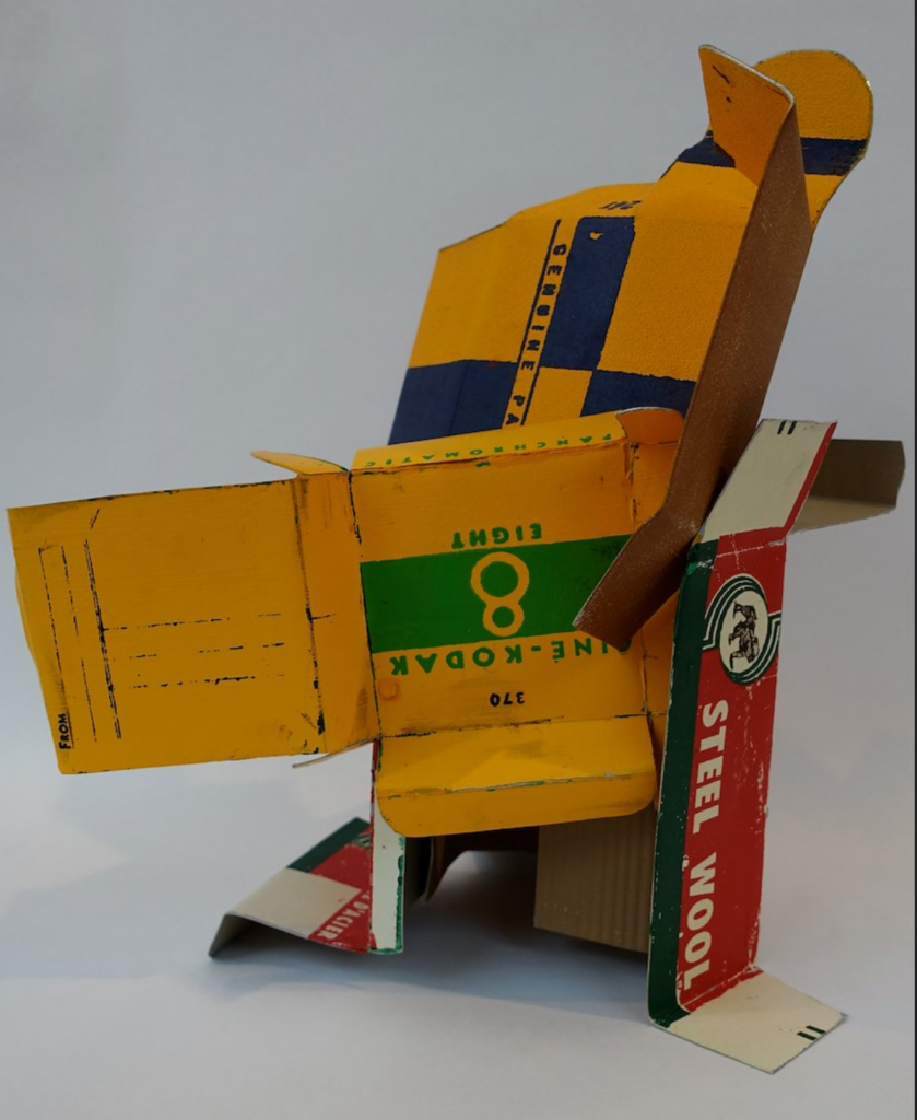
I liked this piece a lot because everything in this was created from scratch. he painted the cardboard, made it look worn and torn, and placed it in a way that makes it look undesirable. You would think it’s trash but when you understand the great effort put into it then you really appreciate it.
The guest speaker this week is Jeremy Borsos. He has done art in various kinds of mediums, but the most known one is making buildings out of architectural salvaged materials. He spoke about each one of his pieces in a very delicate and informative way. A lot of his art is about repurposing or bringing his work back into a new state. One thing I enjoyed and learned was the scale he did his pieces, I always think art needs to be on a canvas like paper, canvas, or screen. He has created pieces that are as big as structures like cabins or houses, it makes me want to push my boundries and think about bigger projects.
I love how he took old, tattered objects and renewed them. I think it’s a great thing to know where we come from and remember our history, seeing these pieces he re-created (like the pressurized metal tank) bring back a piece of history that we get to re-experience. I didn’t learn anything new technically with studio applications, but I do admire the great effort and attention to detail that Jeremy put into his work.